Boothbay Gray Benjamin Moore: The Perfect Coastal Neutral

If you’re searching for a paint color that blends sophistication with versatility, Boothbay Gray by Benjamin Moore is a top contender. Known for its refined balance between blue and gray, this shade is part of Benjamin Moore’s Historic Color Collection and has gained popularity in both modern and traditional homes. Whether you’re looking to repaint your living room, refresh your exterior, or create a serene bedroom retreat, Boothbay Gray offers a timeless solution with a coastal charm.
This comprehensive guide dives deep into the characteristics, undertones, ideal pairings, and practical applications of Boothbay Gray Benjamin Moore. We’ll also answer some of the most common questions homeowners and designers ask before using this paint color. If you’re planning your next home makeover, read on to see why Boothbay Gray might be the perfect choice for you.
What Color Is Boothbay Gray?
1. Color Description
Boothbay Gray (HC-165) is a soft, mid-tone gray with distinct blue undertones. While technically classified as a gray, it leans cool due to the subtle yet noticeable hints of blue, giving it a calming and airy presence.
2. Light Reflectance Value (LRV)
With an LRV of 43.26, Boothbay Gray sits right in the middle of the spectrum. It neither absorbs too much light nor reflects it overly, making it a balanced shade that can appear lighter or darker depending on natural lighting.
3. Undertones to Expect
Boothbay Gray’s blue undertones are what truly set it apart. In well-lit spaces, it can take on a serene bluish hue. In dimmer settings, the gray becomes more pronounced, lending a cooler, muted appearance.
Where to Use Boothbay Gray in Your Home
1. Living Room
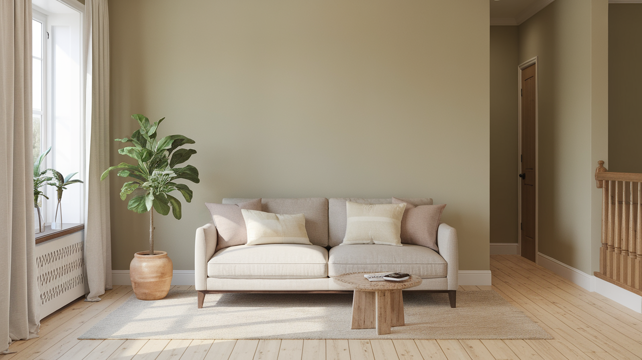
Boothbay Gray is an excellent wall color for living rooms. Its softness complements a variety of textures and tones, creating a cozy yet refined environment.
2. Kitchen Cabinets
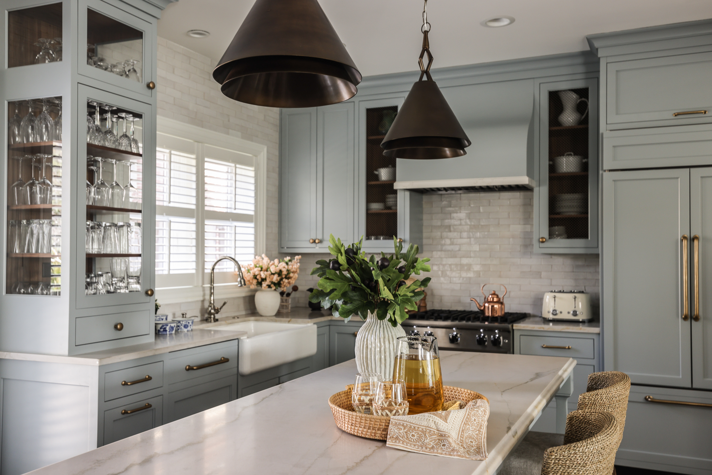
As a cabinet color, Boothbay Gray brings understated elegance. It pairs beautifully with marble or quartz countertops and works well in both modern farmhouse and coastal-style kitchens.
3. Bedroom Retreat
Use Boothbay Gray for a restful bedroom ambiance. Its cool tones promote calmness and pair effortlessly with whites, soft blues, and neutral linens.
4. Bathroom Elegance
When used in bathrooms, this shade reflects light beautifully and offers a spa-like, serene feel. It works wonderfully with silver fixtures and white tile.
5. Exterior Siding or Front Doors
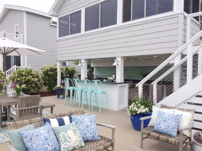
Boothbay Gray is an increasingly popular exterior paint choice. It offers coastal appeal and pairs well with crisp white trim or natural stone features.
Best Colors to Pair with Boothbay Gray
1. Crisp Whites
- Chantilly Lace or Simply White work well as trim or ceiling colors.
- These whites enhance Boothbay Gray’s clean and modern aesthetic.
2. Deep Navy Blues
- Shades like Hale Navy create contrast while maintaining cohesion.
- Perfect for accent walls or furniture pieces.
3. Soft Neutrals
- Warm taupes or beiges balance the cool undertones.
- Think of colors like Revere Pewter or Edgecomb Gray.
4. Natural Wood Tones
- Whether light oak or dark walnut, natural wood finishes soften the coolness of Boothbay Gray.
- Ideal for furniture, flooring, or exposed beams.
5. Muted Greens
- Soft, sagey greens add an earthy depth.
- Colors like October Mist enhance Boothbay’s organic charm.
Comparing Boothbay Gray to Similar Benjamin Moore Colors
1. Boothbay Gray vs. Coventry Gray
- Coventry Gray is a true gray with less blue.
- It feels cooler and more industrial, while Boothbay is warmer and more serene.
2. Boothbay Gray vs. Stonington Gray
- Stonington Gray is lighter and less blue.
- A better option if you want a more neutral backdrop with less color interference.
3. Boothbay Gray vs. Wickham Gray
- Wickham Gray has green-blue undertones and is significantly lighter.
- Suitable for rooms where you want maximum light reflection.
What Makes Boothbay Gray Unique?
1. Historic Yet Modern
Boothbay Gray is part of Benjamin Moore’s Historic Color Collection. While it carries a sense of tradition, it fits seamlessly into modern aesthetics—perfect for transitional design lovers.
2. Versatility Across Styles
From coastal cottages to suburban colonials and minimalist lofts, Boothbay Gray adapts effortlessly to different interior design styles.
3. Year-Round Appeal
Whether paired with cozy textures in winter or light, breezy decor in summer, Boothbay Gray remains relevant and stylish throughout the seasons.
Tips for Using Boothbay Gray Successfully
- Test in Different Lights
Always sample the paint in your space. Morning, afternoon, and evening light can significantly alter its appearance. - Pair with the Right Finish
Use eggshell or satin for walls and semi-gloss for trims or cabinetry. This helps bring out Boothbay Gray’s depth and dimension. - Balance with Texture
Add layers of textiles—rugs, curtains, and throw pillows—to keep the space warm and inviting. - Use as an Accent or Primary Color
Boothbay Gray works as a neutral backdrop or as a feature color. Don’t hesitate to experiment on built-ins, shiplap walls, or island bases.
Frequently Asked Questions About Boothbay Gray
Is Boothbay Gray more blue or gray?
Boothbay Gray is technically a gray with strong blue undertones. In natural light, the blue can be more apparent.
Is Boothbay Gray a good exterior color?
Yes, it’s ideal for exteriors, especially in coastal or New England-style homes. It holds up well against white trim and stone accents.
What undertones does Boothbay Gray have?
It has noticeable cool blue undertones with a very slight green hue in certain lighting conditions.
Does Boothbay Gray work in small spaces?
Absolutely. While it’s not ultra-light, its reflective value and calming tone make small rooms feel polished and airy.
Conclusion: Is Boothbay Gray Right for You?
Boothbay Gray by Benjamin Moore stands out as a refined, adaptable color that balances cool sophistication with timeless warmth. Whether you’re redecorating a single room or reimagining your home’s entire palette, Boothbay Gray delivers a color experience that’s both elegant and approachable. Its ability to work across styles, pair beautifully with other hues, and adapt to changing light makes it a favorite among interior designers and homeowners alike.


